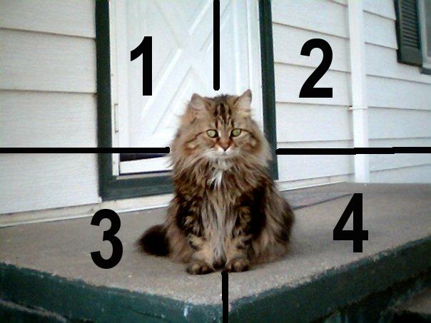
Suggestions for How to Do a Visual Analysis
1. Look at the graphic as a whole.

Analyze for pathos (emotion), logos (facts) and ethos (credibility)
2. Then focus on the foreground. What main elements do you see?

3. Next, ignore the foreground and examine the background.

It is often helpful to quarter the background into four quadrants, and carefully examine the elements in each quadrant.
(For a very complex graphic, you may even need to divide each quadrant into four quarters and examine each 1/16th.)

4. Finally, examine the complete graphic as an object and as a work of art. Possible questions for an objective (Logos) analysis are:
Who drew, composed or photographed this graphic? Do we even know?
When, where and in what context was the graphic created?
What is the style? (Formal? Snapshot? Portrait? Poster? Mug-shot? Story illustration? Or?)
What is the size, medium, presentation or graphic type?
What do the colors, framing and composition say about the graphic?
What is the technical quality of the graphic? Does it look professional, or is it amateurish or childish?
How true is the graphic? Does it look modified, cropped or photoshopped?
How, when and where was this graphic posted, delivered or distributed?
What do you think is/was the original purpose of the graphic? What main argument, if any, do you think the creator was trying to make?
How could this graphic have been created differently?
Possible questions for a subjective (Pathos / Ethos) analysis:
Where, when, and in what context did you first encounter the graphic?
What made you bother to notice or pay attention to it?
Who might have been the original intended audience? Are you part of that audience?
Who might this graphic best serve? Who would most enjoy it? Who, if anyone, would materially gain or profit from it?
Who, if anyone, does this graphic not serve, ignore, insult, antagonize, damage or marginalize?
Why do you suppose the creator selected this particular subject or scene to share?
What can the graphic say about the artist's or photographer's character?
How powerful is the graphic? Is it beautiful? Or is it deliberately ugly?
What emotions, if any, are portrayed in the graphic itself?
What emotions might the graphic evoke in its intended audience?
What emotions do you suppose it might evoke in certain specific audiences other that the intended one?
What emotions did you, yourself feel while viewing the graphic?
How much does the graphic matter? What would its degree of impact or significance be for you, for the intended audience, or for the world?
Do you, personally, like the graphic? Why or why not?
OW Rev. 2/10 with thanks to Dr. Angela Petit.
Photo: "Claire," by Rita Charlene Williamson (2005), used with permission.
| Owen M. Williamson - Education Bldg 211E - phone: (915) 747 7625 - fax: (915) 747 5655 |
| The University of Texas at El Paso - 500 W. University Ave. - El Paso, TX 79968 |
| Important Disclaimer |

Except for original graphic, Copyright 2005 by Rita Williamson, Open Courseware | OCW |This work is dedicated to the Public Domain..