A fictitious client from London that sells records with a mission to expand the vinyl revival.
A fictitious client from London that sells records with a mission to expand the vinyl revival.

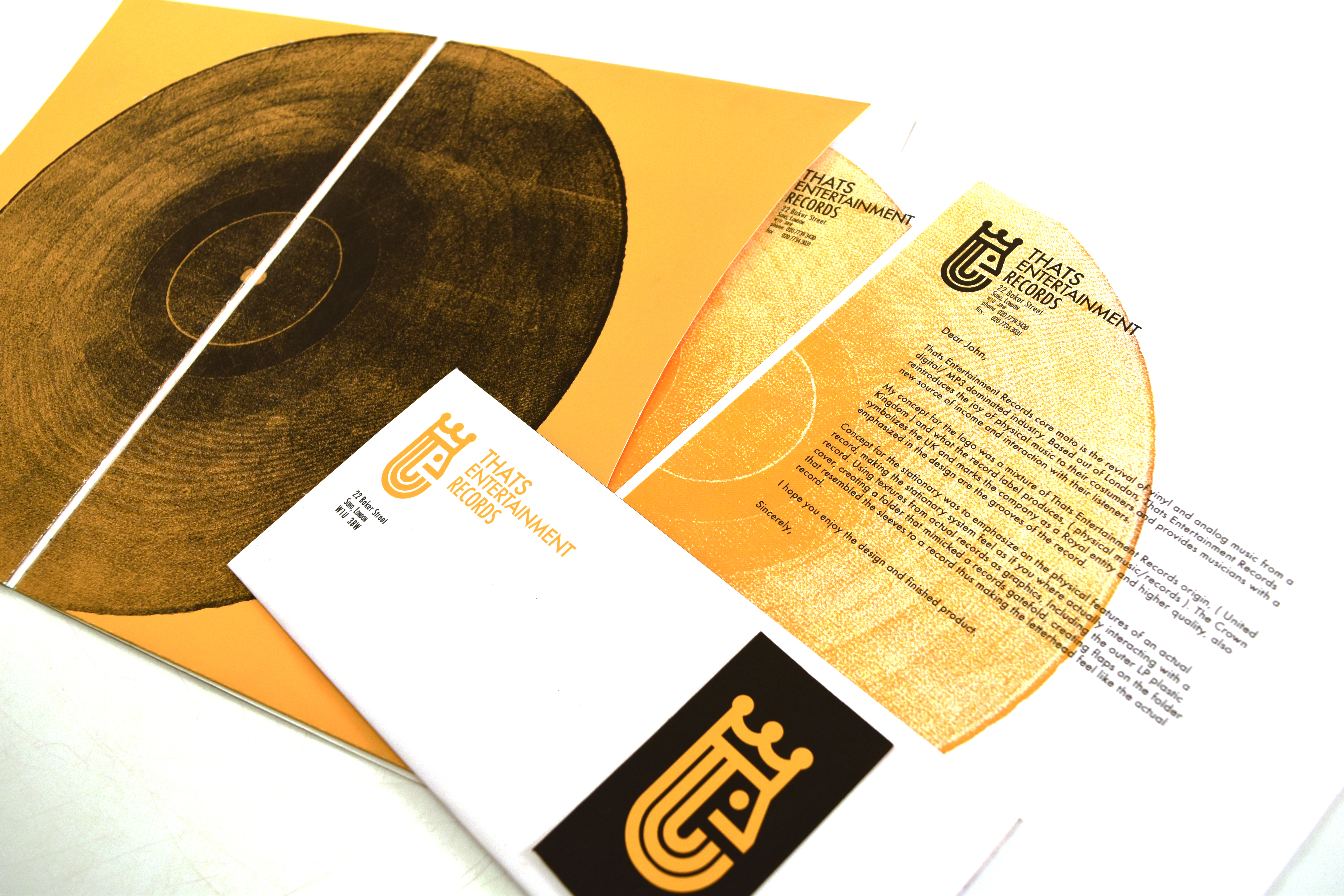
There were three main factors that played into the logo of this client one was the letterform “e” which stood for entertainment, another was the location of this client in this case it was London and the last was the format or the physical object of a record. All these elements were housed in the main letterform “e”. Combing elements such as the grooves of a record and visual motifs such as a crown to signify a location.
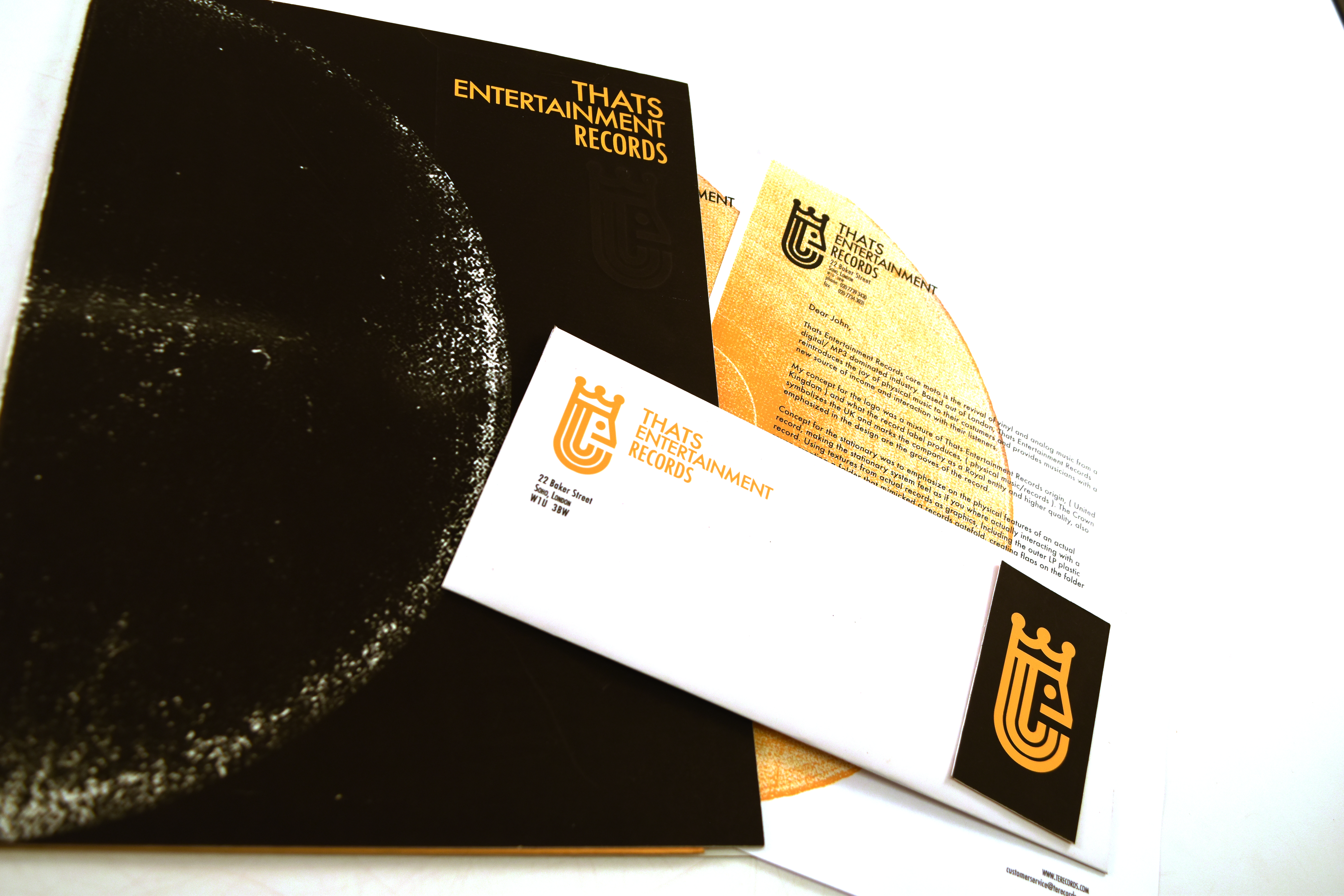
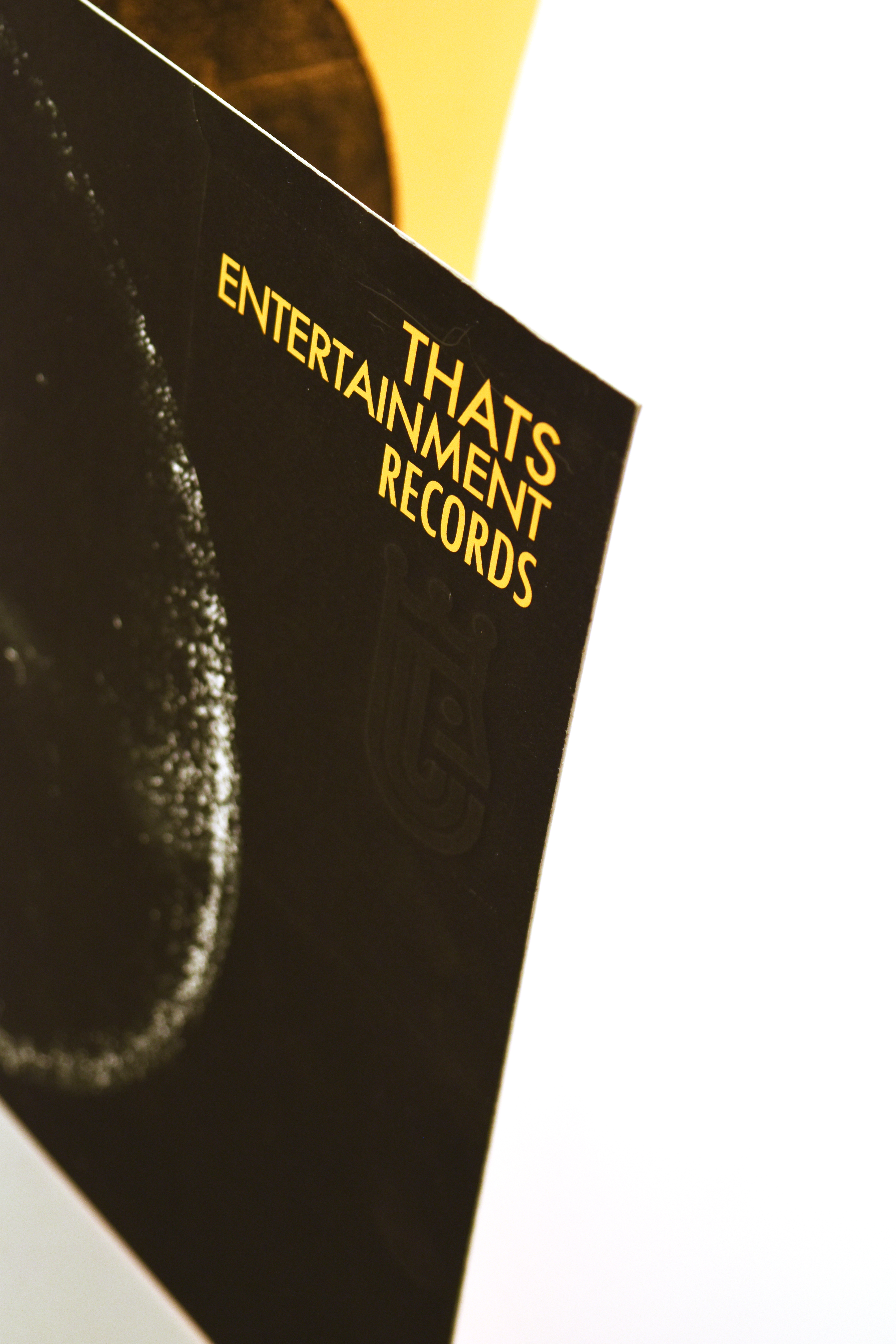
The stationary was meant to mimic that of a double LP, the feel and look of an old worn record. Adding textures to the front and to the inside to make the folder feel as if you were opening up a record folio.